Logo Design is Really Hard
Designing the perfect logo to represent a brand is incredibly difficult. Here are some of my favorite technology logos that got it right.
I spent a couple hours yesterday chatting with a designer who is helping me with a logo for the new project I am working on. Our conversation, along with the countless hours I have already spent trying to give shape to a brand, got me thinking: logo design is really hard.
One of my prior employers proves an excellent case study, as they just so happened to have overhauled their logo this year.
Old logo:

New logo:
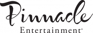
Yikes! I really cannot understand why they chose this new design. How could they possibly think this whimsical, Disney-esque logo is the right choice for a casino company?
At least the proud font and 5-star theme of the previous logo brings to mind hospitality and quality. This new logo just baffles me; not only does it seem like a poor fit, it also looks like it belongs in the fourth category of this guide to generic and overused logos. I hope they didn't pay too much for it.
But hey, I'm sympathetic because logo design is hard! Conveying name, brand, and product all in one little design is not a simple task. I have mad respect for the designers who can pull it off.
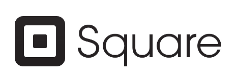
After chatting with the designer I am working with about form, symbolism, typography, color, and all of the other subtle components to a brand, I think we are on the right track. Below are the brands I chose as examples to try to emulate. Note that all of these are companies, products, or projects from the technology industry, as they seemed the most fitting.


My New Logo
Update January 16, 2015: It's finally time to unveil my new logo. Voila!
Neato
After several iterations, the designer and I landed on this relatively simplistic emblem to brand my new project.
Considering that many traditional brands gradually simplify their logo design over time, you find that nowadays many new brands start very simple. Our concept is probably most similar to that of Square's (above). It is our hope that the emblem can become one that is easily recognizable and very versatile in its use.
Share your thoughts with me on Twitter @cschidle.
This is an ad-free site. Please consider supporting my writing with one of the support buttons below.